Wed 27 April 2016
What's in a theme
Rationale
There are so many reasons why the concept of a theme would be helpful. Your app might need to make use of different colours, either for different client branding, selectable - or even customisable user themes. Whatever the case, getting on top of themes from the get-go makes things alot easier, especially if you or your company decides to rebrand down the future; there's nothing worse than reading through a bunch of hard-coded values and trying to decide what came from where.
The Setup
As many of you are probably aware, Xamarin Forms supports the notion of "Style" which provides a very good basis for themes.
Quick Primer: A style is basically a collection of bindable properties and values that are tied together as a collection object and appliable to a particlar VisualElement. It helps when you wish to change your design during development, but more profoundly on the fly perhaps even as a use preference.
Putting in some Code
A class for the theme itself will encapsulate all the style based attributes of the application. As you can see, for sucha small app, some of the properties are calculated automatically from the main text and main background. Adding different values by a constructor explicitly will allow you greater control, for this purpose it is very convenient however.
public class Theme {
    public Theme(Color defaultBG, Color defaultText) {
        DefaultBG = defaultBG;
        DefaultText = defaultText;
        var lightness = DefaultBG.Luminosity > 0.5 ? -0.25f : 0.25f;
        NavBG = DefaultBG.AddLuminosity(lightness);
        NavText = DefaultText;
    }
    public Color DefaultBG { get; set; }
    public Color DefaultText { get; set; }
    public Color NavBG { get; set; }
    public Color NavText { get; set; }
}
Now we apply the theme, here is a complete application class - assume there are custom subclasses of ContentPage, NavigationPage as implied (App is a master detail app).
public class App : Application {
    public App () {
        // The root page of your application
        Resources = new ResourceDictionary();
        Resources ["theme"] = new Theme (Color.FromHex ("#CCCCFF"), Color.FromHex ("#333333"));
        ApplyTheme (Resources ["theme"] as Theme);
        MainPage = new RootPage();
    }

    public static void AddStyle(Type t, Dictionary<BindableProperty, Object> items, String name = null) {
        var style = new Style(t);
        foreach(var pair in items) {style.Setters.Add (pair.Key, pair.Value);}
        Application.Current.Resources [name ?? t.FullName] = style;
    }

    private void ApplyTheme (Theme theme)
    {
        //Navigation (Implicit)
        AddStyle (typeof(SampleNavigation), new Dictionary<BindableProperty, Object> () {
            [NavigationPage.BarBackgroundColorProperty ] = theme.NavBG,
            [NavigationPage.BarTextColorProperty ] = theme.NavText
        });

        //Labels - main
        AddStyle(typeof(Label), new Dictionary<BindableProperty, Object> () {
            [Label.TextColorProperty ] = theme.DefaultText } );

        //Main Pages
        foreach(var pageType in new Type[]{typeof(HomePage)}) {
            AddStyle (pageType, new Dictionary<BindableProperty, Object> () {
                [ContentPage.BackgroundColorProperty ] = theme.DefaultBG
            });
        }

        //Menu Pages
        foreach(var pageType in new Type[]{typeof(MenuPage)}) {
            AddStyle(pageType, new Dictionary<BindableProperty, Object> () {
                [ContentPage.BackgroundColorProperty ] = theme.NavBG } );
        }
    }
How it looks
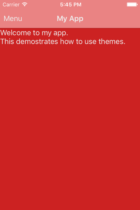
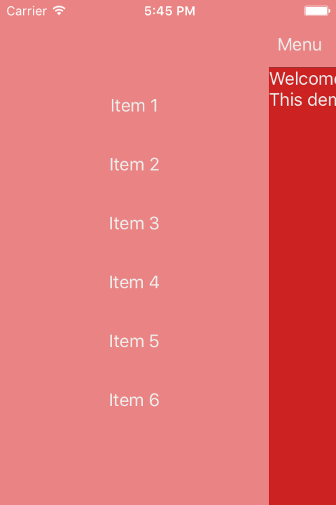
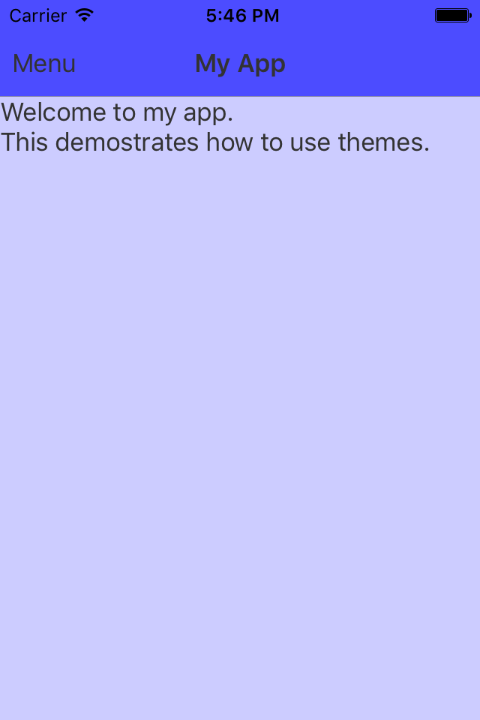
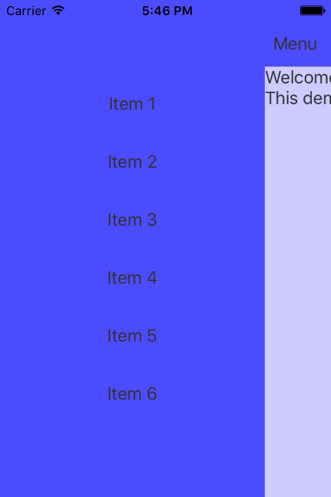
Since a picture is worth a thousand lines of code, have a loook at some example themes. Again this is really basic but allows you to see the flexibility offered.
| Theme | Main | Menu |
|---|---|---|
| Main Background: #CC2222 Main Text: #EFEFEF |
 |
 |
| Main Background: #CCCCFF Main Text: #333333 |
 |
 |
Bonus
On iOS you may wish to change the status bar content colour to match your navigation bar and app theme. Please disable view controller based status bar appearance and provide a renderer for your NavigationPage subclass (or root page). As you can see below we can automatically determine if the status car content should be light or dark based on the navigation background's luminosity.
public override UIKit.UIStatusBarStyle PreferredStatusBarStyle () {
    return (App.Current.Resources["theme"] as Theme).NavBG.Luminosity > 0.5f ?
    UIKit.UIStatusBarStyle.Default : UIKit.UIStatusBarStyle.LightContent;
}
Conclusions
This just scratches the surface, but you can see how easy it is to change your app's themes without rewriting alot of code, and the beauty of it is that the changes are consistent and can even be bound in XAML using style="{DynamicResource StyleName}" for explicitly named themes (here we have just discussed Implicit themes), it is easy enough to follow from here, you just provide a string based name for the style, and infact this helper method accepts it as the last argument (it is defaulted to null in which case the default style key of the class name is used, hence there is only one default style per VisualElement subclass).